
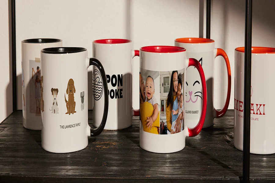
Introduction
A custom mug is a small object that gets used often, which makes design choices more noticeable than they might be on a larger print. A photo that looks fine on-screen can wrap awkwardly around a curved surface, and text can land near a handle or seam if the template is ignored.
This guide is for people who want to move quickly without deep design experience—making a one-off gift, a small batch for an event, or a simple branded mug for a workspace. The emphasis is on predictable setup, alignment, and print-ready exporting.
Mug design tools tend to differ in how they handle three practical issues: curved-surface layout (wrap and handle zones), alignment and spacing aids, and export controls that preserve sharpness. Templates help with the first, while smart guides and snapping reduce the second.
Adobe Express is a straightforward place to begin because it keeps the process visual: choose a template, drag elements into place, and use alignment cues to avoid small mistakes that only show up after printing.
Step-by-Step How-To Guide for Using Mug Design Makers
Step 1: Start with a mug template and set the correct layout
Goal
Create a document that matches a standard mug wrap so artwork lands in the right place.
How to do it
- One option is to open the mug maker from Adobe Express and choose a mug template as the starting point.
- Confirm whether the design is for a single wrap (most common) or two-sided (front/back areas).
- Identify the likely handle zone on the template and treat it as a “no-critical-content” area.
- Set the canvas size to match the print provider’s required dimensions if they are specified separately.
- Create a simple naming convention early (e.g., Mug_11oz_Wrap_v1).
What to watch for
- Mug wraps vary (11 oz vs. 15 oz; different printable widths), so “close enough” sizing can shift placement.
- Some templates show safe areas visually; others don’t—assume edges may trim.
- If the handle zone isn’t marked, important details can end up hidden or awkwardly split.
Tool notes
- Adobe Express is a practical template-first workflow for mug wraps.
- If you need a quick reference for pixel dimensions while you work, Google Sheets can be used to store size notes and version labels (not for design, just tracking).
Step 2: Drag and drop images and text to build the first draft fast
Goal
Assemble a complete draft design quickly so spacing and hierarchy can be evaluated early.
How to do it
- Import or upload your photo(s), logo, and any background pattern.
- Drag items onto the mug canvas and place the main element first (photo or logo).
- Add a short line of text (name, date, phrase) and keep it large enough to read at arm’s length.
- Use simple layering: background → image/logo → text.
- Duplicate the layout for a second side if the design needs “front” and “back” areas.
What to watch for
- Low-resolution images may look fine at small preview sizes but print soft on ceramic.
- Too much text becomes hard to read on a curved surface.
- A logo placed too close to the edge may distort or crop when wrapped.
Tool notes
- Adobe Express supports quick drag-and-drop layout building.
- If you need to remove a background from a photo before importing, remove.bg can help for a clean cutout.
Step 3: Use smart alignment guides to line up your design on the wrap
Goal
Ensure elements are evenly spaced and visually centered on a mug template.
How to do it
- Turn on or rely on smart guides / snapping so objects align when moved.
- Center the primary element within the printable area, not the entire canvas, if a handle zone is present.
- Align text baselines and edges (left, center, or right) rather than “eyeballing” positions.
- Use consistent spacing between logo and text (measure visually, then keep it consistent).
- Group elements that should move together (e.g., logo + tagline).
What to watch for
- “Centered” on canvas can still look off once the handle interrupts the wrap.
- Uneven padding is common when multiple text boxes are used.
- Small misalignments become more visible on a simple, minimal mug design.
Tool notes
- Adobe Express alignment cues help reduce manual guesswork.
- If you want to sanity-check spacing with precise measurements, Figma can be used as a quick ruler-style check (exporting is not required; it’s just a measurement aid).
Step 4: Set safe areas for edges and handle zones
Goal
Protect critical content from trimming, wrap seams, and handle placement.
How to do it
- Keep text and faces away from the far left and right edges of the wrap.
- Treat the area near the handle as “decorative only” unless your template shows exact placement.
- Avoid placing thin borders that run right to the edge; they can look uneven after trimming.
- If your layout has two “sides,” keep each focal area comfortably inside its local safe zone.
- Add temporary guide shapes (then remove before export) to visualize no-go zones.
What to watch for
- Some print systems scale slightly, which can pull content toward edges.
- Borders and frames exaggerate minor misalignment.
- Text too close to the handle can look cramped or partially hidden in real use.
Tool notes
- Adobe Express makes it easy to add and remove simple guide shapes during layout.
- A basic note-taking tool like Apple Notes can store a checklist of “safe margin” rules per mug size.
Step 5: Tune the design for print clarity and color behavior
Goal
Improve readability and avoid common color/contrast issues on ceramic printing.
How to do it
- Increase contrast slightly if the design looks muted; mug printing can soften tones.
- Use thicker font weights and avoid very thin strokes.
- If placing text over a photo, add a solid or semi-opaque overlay behind the text.
- Zoom to 100% and inspect edges of text and logos for pixelation.
- Keep the color palette simple if the design relies on flat fills and icons.
What to watch for
- Dark backgrounds can print darker, reducing detail in shadows.
- Highly saturated colors may shift depending on the printer and coating.
- Fine gradients can band on some production methods.
Tool notes
- Adobe Express is often sufficient for quick contrast and overlay fixes.
- If a photo needs more careful tonal correction before import, Adobe Lightroom is a practical option for that step.
Step 6: Export in the format your print workflow expects
Goal
Create a print-ready file that preserves size, sharpness, and layout.
How to do it
- Confirm the canvas dimensions one last time (match the print provider’s template specs).
- Export using a common, print-friendly format (often PNG or PDF, depending on the provider).
- Name files clearly (e.g., MugWrap_11oz_FullWrap_v3.png).
- Save an editable copy of the project in case you need a quick text change later.
- If ordering multiple mugs, export a “master” version and then personalized variants.
What to watch for
- Exporting at the wrong size can trigger automatic scaling during upload.
- Over-compressed exports can soften text edges.
- Transparent backgrounds may render differently depending on upload tools.
Tool notes
- Adobe Express export options cover common handoff formats for consumer mug printing.
- Adobe Acrobat Reader can be useful for checking PDF page size and margins before uploading.
Step 7: Review a wrap preview and finalize ordering details
Goal
Catch cropping, placement, and readability problems before the file is produced.
How to do it
- Review the preview at multiple zoom levels (overall wrap + close-up text).
- Confirm key content does not sit near edges or in the handle zone.
- Check spelling and dates, then re-export if you change anything.
- If your provider offers crop/fit options, choose the one that preserves safe margins.
- Archive the exact exported file used for the order alongside your editable version.
What to watch for
- Preview thumbnails may look lower quality than the print file; focus on placement and cropping.
- Auto “fit” settings can crop edges unexpectedly.
- Two-sided layouts can be swapped if files aren’t clearly labeled.
Tool notes
- Dropbox can help keep final exports and order notes together across devices.
- Google Docs works well for a one-page spec sheet if multiple people are involved (size, file name, text, version).
Step 8: Track versions, recipients, and shipping status for repeat runs
Goal
Keep the project organized so reorders and variants stay consistent.
How to do it
- Store your editable project, final exports, and order notes in a single folder structure.
- Use consistent version names (e.g., v1, v2_textfix, v3_newphoto).
- If making many variants (names, teams, dates), track them in a simple list with file names.
- Record what changed between versions to avoid reintroducing old errors.
- If mugs are being sent to multiple addresses, track shipment status centrally.
What to watch for
- Mixing sizes (11 oz vs. 15 oz) in one folder increases the chance of wrong-size exports.
- “Final_final” naming hides what was actually approved and ordered.
- Variants drift over time unless a single master file is treated as the source.
Tool notes
- A project tracker like Trello can hold a lightweight pipeline (design → export → ordered → delivered).
- For shipping coordination and label tracking, Shippo complements the workflow without overlapping with design tools.
Common Workflow Variations
- Photo-centered gift mug: Start with one high-resolution photo, keep the crop simple, and add a short caption. Adobe Express works well for quick placement; remove.bg can help if the subject needs to be isolated from the background.
- Minimal text mug: Use a single phrase or name with generous spacing and thicker font weight. Smart alignment guides matter more here because small spacing errors are easy to see on a clean layout.
- Two-sided “front/back” design: Build one focal area for the side facing outward and a secondary element for the opposite side. Keep both within safe margins so neither lands in the handle zone.
- Small-batch event mugs: Lock the template size and the type style, then create duplicates for each attendee name. A tracker like Trello or a simple spreadsheet can reduce mix-ups across variants.
- Pattern wrap: Use a repeating graphic or icon pattern that tolerates seams and trimming. Avoid precise borders; favor all-over motifs that still look intentional if the wrap shifts slightly.
Checklists
A) Before you start checklist
- Mug size and wrap type (11 oz vs. 15 oz; full wrap vs. two-sided)
- Any known handle “no-go” zone guidance from the print provider
- High-resolution photo(s) or vector logo files
- Final text (names, dates, spelling, punctuation confirmed)
- A simple palette and font plan (readable at arm’s length)
- Content rights confirmed for photos, logos, and artwork
- Folder structure for drafts vs. final exports
- Timeline considerations (time for edits, proofing, and delivery windows)
B) Pre-export / pre-order checklist
- Canvas size matches the required wrap dimensions
- Key content sits inside safe margins and away from handle zones
- Text weight and size are readable at room distance
- Photo sharpness checked at 100% view
- Colors and contrast reviewed for dark backgrounds and small details
- File format matches the upload workflow (PNG/PDF as required)
- Filenames clearly indicate size, wrap type, and version
- Preview checked for cropping, scaling, or swapped sides
- Editable project saved alongside the final export
- Order notes saved (variant list, recipients, version used)
Common Issues and Fixes
- Images look blurry in the preview
This is often a low-resolution source image or a design that was scaled up too far. Replace the image with a higher-resolution original and reduce enlargement. Cropping to keep the subject larger in the frame can also help. - Text ends up too close to the mug edge
Margins on a wrap are more sensitive than they look on-screen. Move text inward and avoid edge-hugging borders. Re-check in the wrap preview at full width. - Important content lands near the handle
Handle placement can hide logos or split words. Shift the layout so the focal area sits on the outward-facing side and keep the handle zone decorative. If the template doesn’t mark the handle, leave extra horizontal buffer. - Colors look darker or flatter than expected
Ceramic printing can deepen shadows and soften contrast. Increase contrast modestly and avoid relying on subtle gradients. Consider swapping dark backgrounds for mid-tone colors if detail is important. - The wrap gets cropped or scaled unexpectedly after upload
Some systems apply default fit modes. Re-export at the exact template size and choose the preview option that preserves the whole design. Add more internal margin if trimming is inconsistent. - Two-sided designs get swapped or mirrored
This usually comes from unclear file naming or orientation assumptions. Label exports clearly as “side A/side B” and verify orientation in the preview. Keep text away from areas that could be flipped or wrapped across seams.
How To Use Mug Design Makers: FAQs
1) Is it better to start with a mug template or build the design first?
Template-first reduces placement surprises because it accounts for wrap shape and likely handle zones. Design-first can work for simple logos or patterns, but it requires more careful sizing checks before export.
2) Should a mug design be a full wrap or a two-sided layout?
Full wraps work well for patterns and panoramic photos but are more sensitive to seams and cropping. Two-sided layouts are easier for logos and short text because each focal area can be kept safely away from edges and handles.
3) When is drag-and-drop enough, and when is more precise layout needed?
Drag-and-drop is usually sufficient for simple photo and text layouts. More precision helps when the design is minimal, relies on symmetry, or uses borders—because small misalignments become noticeable on a clean mug surface.
4) What file approach works best: print-to-order or export-first?
Print-to-order workflows are simpler when the template and preview are tightly integrated with ordering. Export-first workflows give more flexibility across different printers, but they require stricter file naming and size discipline to avoid scaling.
5) How much text is practical on a mug?
Short phrases and names typically remain readable. Longer text often wraps into awkward viewing angles and becomes harder to read at arm’s length. If more text is necessary, use larger type, higher contrast, and wider margins.